Case Study: Champs Hill
Refining a Heritage Brand: The Champs Hill & Bowerman Collection Rebrand
Champs Hill is a remarkable place. Home to The Bowerman Charitable Trust, it supports classical music, and art, while also sharing a significant private collection of British art with the public. It’s a space where heritage, creativity, and generosity intersect — and the brand needed to reflect that balance more confidently and consistently.
The Challenge: A Strong Identity Without a System
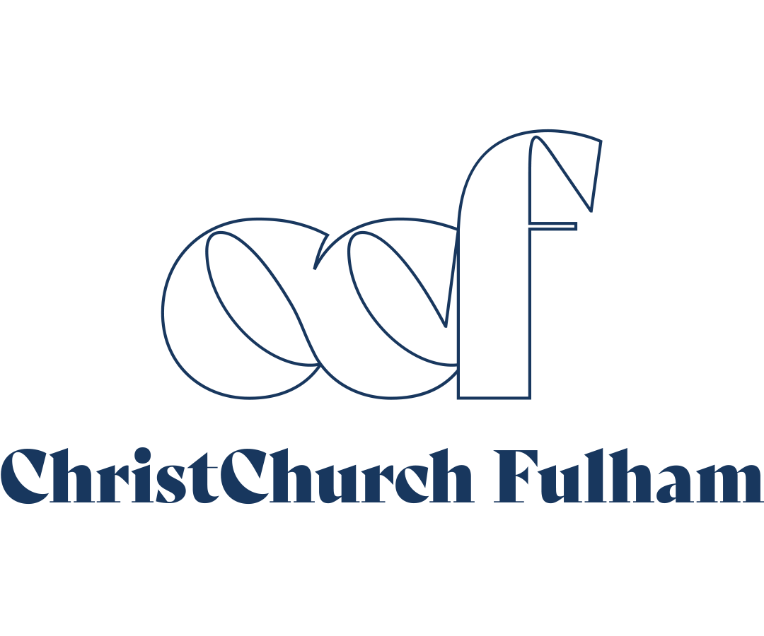
Champs Hill already had something precious: a recognisable logo idea rooted in music. The original clef-inspired symbol had been sketched by Mary Bowerman, and it carried deep meaning and history. It was well known among their audience and emotionally connected to the organisation’s purpose.
What they didn’t have was a cohesive brand system.
Over time, as more exhibitions, posters, programmes, and communications were produced, the identity had become fragmented. Typography varied. Colour use was inconsistent. Layouts didn’t always feel related to one another. There was no single reference point for designers, staff, or collaborators to follow.
In short:
✔ A strong idea existed
✖ But it wasn’t being used to its full potential
Champs Hill needed:
• A refined version of their logo that honoured its origin
• A clear typographic voice
• A consistent colour palette
• A visual system that could flex across posters, print, digital, and merchandise
• And a set of guidelines that made it easy for everyone to use the brand well
The Approach: Respect, Refinement, and Structure
Our first step wasn’t to redesign — it was to understand.
We looked closely at the original logo concept and the role it plays in Champs Hill’s story. The musical clef symbol is not decorative — it’s symbolic of the Trust’s commitment to music and the arts. That meaning needed to stay intact.
Rather than replacing it, we refined it.
The logo was carefully redrawn and balanced on a grid system, improving alignment, spacing, and consistency while preserving the essence of Mary Bowerman’s original idea. The result is a mark that feels both timeless and precise — better suited to modern reproduction across print and digital media, without losing its soul.
From there, we built a full identity system around it.
Typography: A Voice That Matches the Place
Champs Hill is elegant, cultured, and rooted in tradition — but it’s also open, warm, and accessible. We needed typefaces that could carry that tone.
Together with the team, we selected:
• Beaufort Pro as the primary typeface — refined, detailed, and expressive for headlines and titles
• Mulish as the secondary typeface — clean, contemporary, and highly readable for body copy
• Baskerville as a fallback option when Beaufort isn’t available
This pairing allows communications to feel both classical and current, reflecting Champs Hill’s unique position between heritage and living culture.
Colour: Grounded, Calm, and Confident
The colour palette centres on a rich Champs Hill red — a bold, recognisable anchor that brings energy and focus to layouts. Around this, we developed a series of warm neutrals inspired by stone, paper, and natural materials.
The result is a palette that feels:
• Calm but confident
• Traditional without being stuffy
• And flexible enough for exhibitions, print, merchandise, and digital use
A touch of red is encouraged in most applications — not overwhelming, but present enough to maintain brand recognition.
Pattern & Application: A Visual Language That Extends
We also developed a repeat pattern using the symbol — subtle, graphic, and adaptable. It can appear on envelopes, tissue paper, and interior surfaces, adding richness without noise.
From there, we explored how the brand lives in real-world formats:
• Posters
• Stationery
• Envelopes
• Merchandise
• Exhibition materials
Each application was designed not just to look good on its own, but to feel like part of a family.
The Guidelines: Making the Brand Easy to Use
One of the most important outcomes of this project was the Brand Guidelines document itself.
This isn’t just a PDF — it’s a tool.
It sets out:
• How the logos are constructed
• Which versions to use, and when
• Clear space rules
• Colour specifications
• Typography usage
• Examples of correct and incorrect use
• And guidance for real-world applications
The goal was simple:
To make it easy for Champs Hill and their collaborators to use the brand well — consistently, confidently, and beautifully.
The First Public Expression: The Piers Ottey Exhibition
The Piers Ottey exhibition became the first real-world test of the new branding — and the first public-facing materials produced using the new system.
Posters, layouts, and promotional materials for the exhibition brought everything together:
• The refined logo
• The new typography
• The colour palette
• And the overall tone of the identity
Seeing the brand in action — on walls, in print, and out in the world — is always the most rewarding part of any project. The Piers Ottey materials marked the moment when the brand stopped being a document and started being lived.
The Outcome: A Brand That Feels Like It Belongs
The final result is not a radical reinvention. It’s something much better suited to Champs Hill:
• A respectful evolution
• A clearer voice
• A stronger sense of cohesion
• And a visual identity that matches the quality of the art, music, and ideas it supports
Champs Hill now has a brand that feels:
• Rooted in its history
• Confident in the present
• And ready for the future
We’re proud to have worked collaboratively with the Champs Hill team on this project — and especially proud that the identity continues the story first imagined by Mary Bowerman, now refined into a complete, usable, and living system.
Projects like this are why we love what we do.
Not because we get to make something new —
but because we get to help something meaningful become clearer.